Year
2025
Client
Honig Löffler
Category
Brand Identity & Packaging Design
Product Duration
3 Weeks
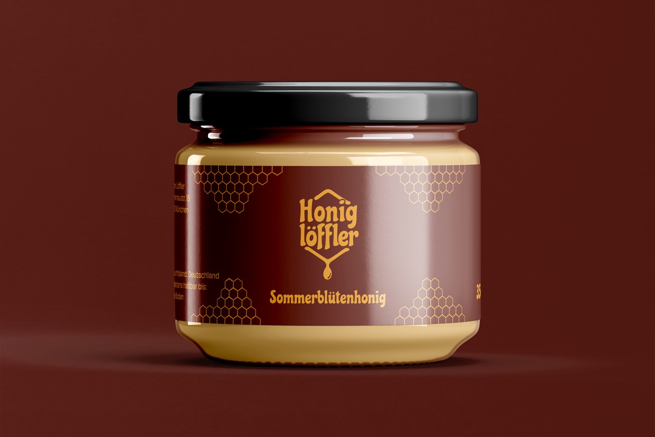
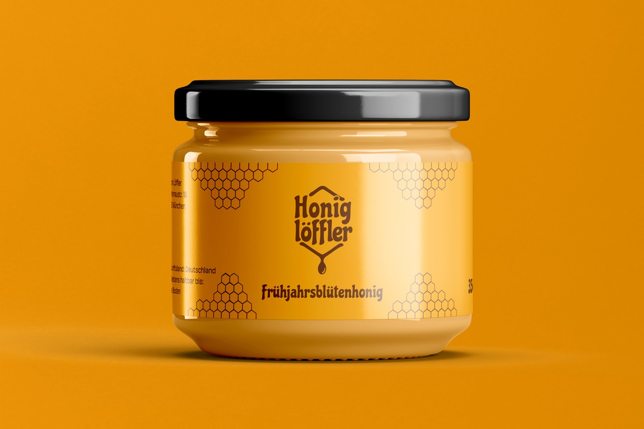
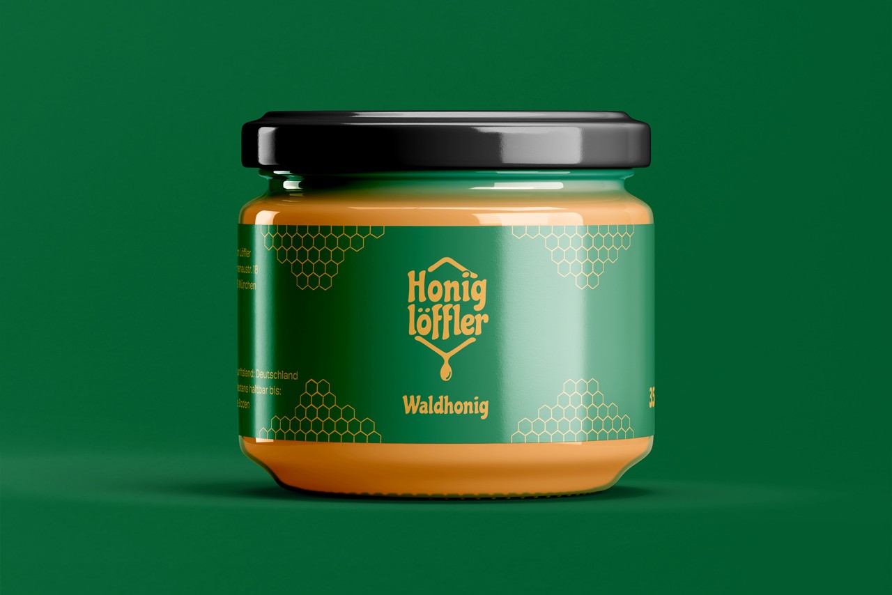
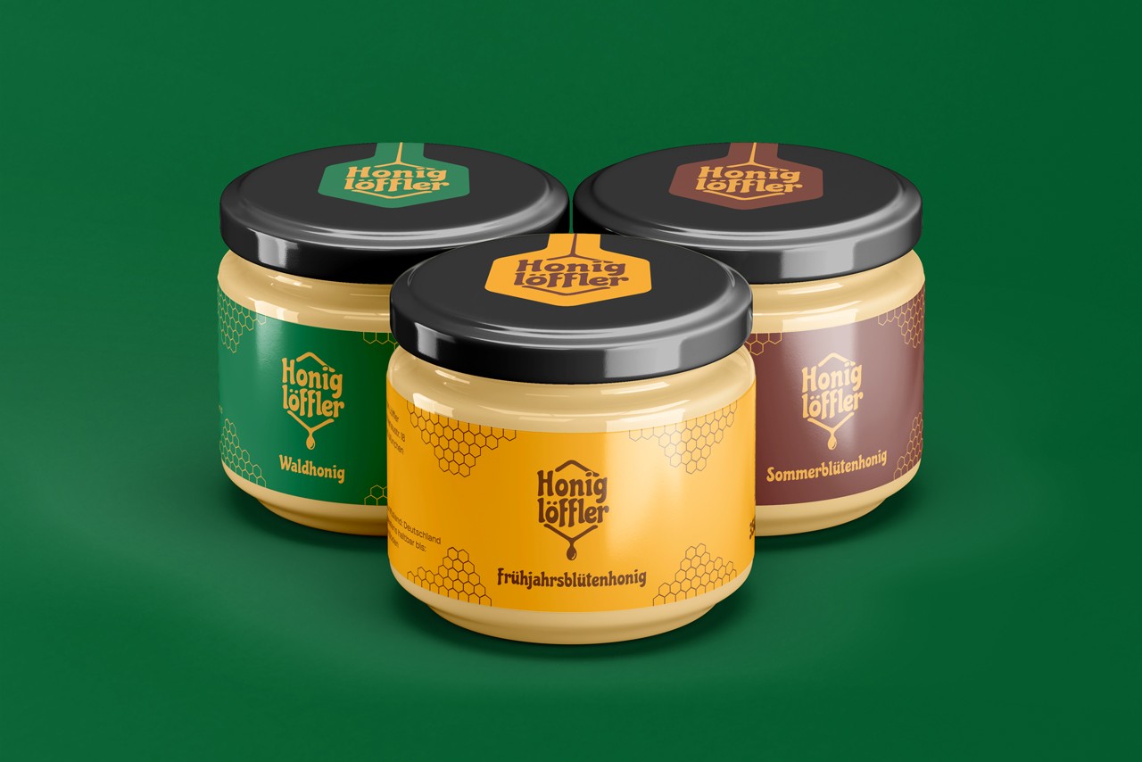
The logo features a stylized drop-shape that resembles a spoon, subtly referencing both the brand name and the artisanal production. Each honey variety is color-coded while maintaining a cohesive system, making the line easily recognizable and shelf-friendly.
Across the range, each honey variety gets its own colour while sharing one consistent system — so the line reads as a family at a glance and stays easy to navigate on the shelf. The honeycomb language carries onto every jar, turning a row of products into a recognisable, collectible set.