Year
2025
Client
Markus Hübner
Category
Logo & Branding
Product Duration
2 Weeks
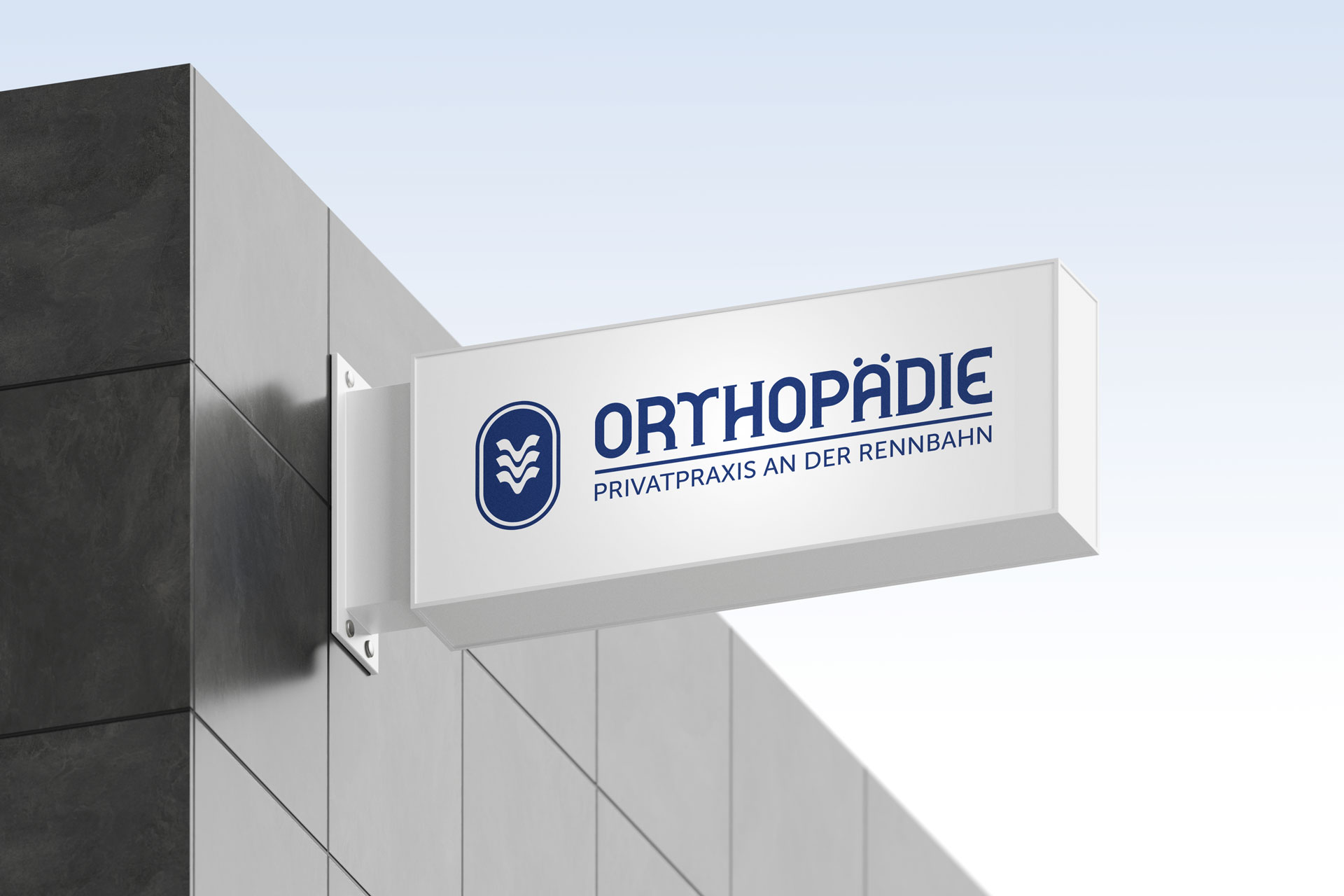
I developed a logo and core brand system that are entirely derived from the racetrack itself. The oval track shape became the formal basis for both the symbol and a custom wordmark: every letter in the logotype echoes the geometry of the track, creating a quiet, distinctive serif that feels both medical and refined. The icon combines three vertebrae into a spine segment which, on second glance, can also be read as three horses in a head-to-head race. A restrained colour palette centred around a deep “medical” blue and a clear typographic system underline the idea of a high-end, long-lasting private practice rather than a trend-driven brand.
Based on this foundation, I created a compact brand toolkit: stacked and horizontal logo lockups, colour and typography guidelines, and a range of designs for signage, light column, business cards and medical documents. The visual identity is designed to translate seamlessly into both print and digital touchpoints, including a future website and practice communication. The result is a coherent, understated brand that links orthopaedics, human proximity and the unique racetrack location in a single, memorable mark.


social