Year
2025
Client
TOKAY'S
Category
Brand Identity
Product Duration
3 - 4 Weeks
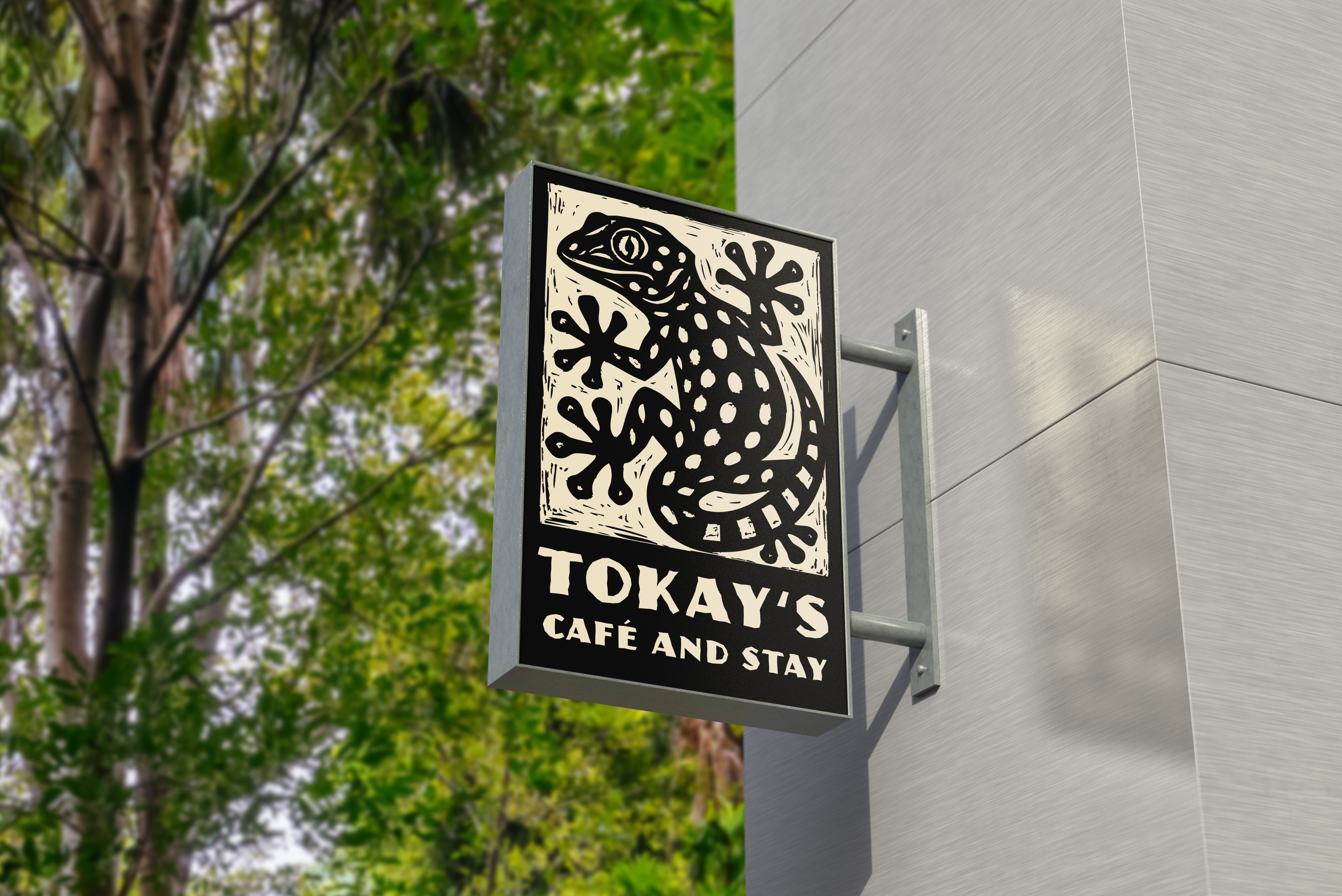
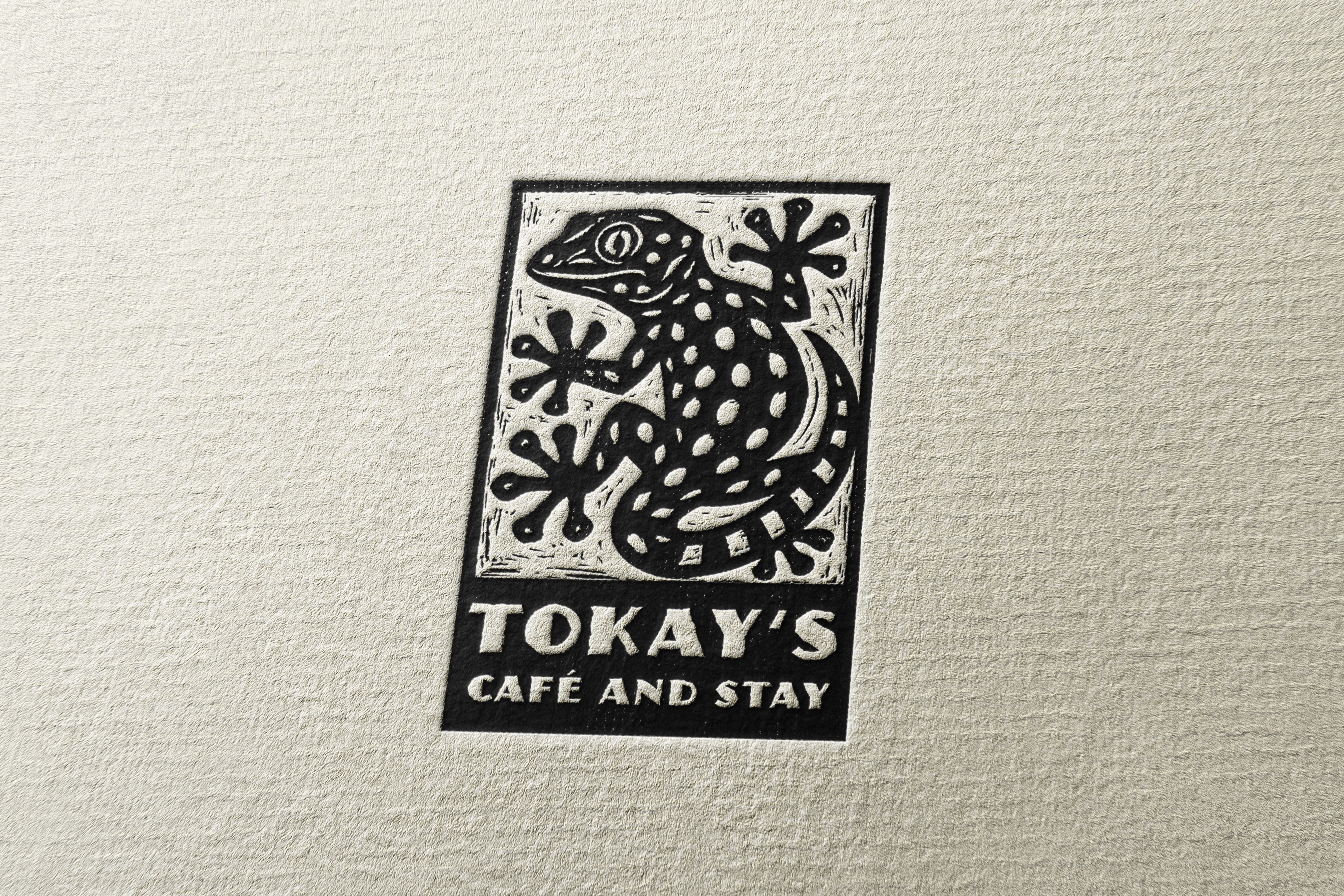
At the center of the identity is the Tokay Gecko, a species native to the region and part of the everyday surroundings of the house. As a symbol, it anchors the brand in its location and expresses the connection between the built space and the surrounding jungle.
The logo was developed in a woodcut-inspired style, referencing traditional craftsmanship and artistic expression. Its structured, rectangular framing contrasts with the organic form of the gecko, creating a visual tension that results in a calm, balanced appearance — dynamic in form, quiet in presence.
The typographic system combines Museo Sans Rounded and ITC Juanita to balance clarity and character. While Museo Sans provides a calm, readable foundation, Juanita introduces a handcrafted, expressive accent inspired by woodcut typography.
The colour palette draws directly from the architecture and environment of the house — concrete, bamboo, clay, and earth tones. By working with muted, natural colours, the brand creates contrast to the vibrant tropical surroundings while reinforcing the feeling of a refined yet relaxed retreat.

By fusing natural elements, earthy tones, and traditional aesthetics with contemporary layouts, this portfolio aims to bridge the gap between nature and digital creativity. It serves as a platform for showcasing personal projects, highlighting a connection to the roots and the unique experiences that inspire each piece of work.


social